In this poster, type is wrapped into perspective to form a cube, the letters become architecture and rhythm. The design explores how letterforms can move beyond legibility to become structural identity.
I craft editorial, typographic and product visuals — a design language rooted in intent and clarity.

I’m Abhishek Jagtap a curious, process-driven designer who trains his eye to see the world the way a designer would. Currently studying for a B.Des, I focus on graphic design and UI/UX, with growing work in 3D and packaging. I aim to be the kind of designer clients can trust blindly; to look at a problem once and begin to ideate immediate, considered solutions. I work in Figma, Blender, and the Adobe Suite, and I use AI-assisted design for rapid iteration. My approach is simple and rigorous, every design must mean something and solve a problem. I push for detail and clarity in every pixel.
In this poster, type is wrapped into perspective to form a cube, the letters become architecture and rhythm. The design explores how letterforms can move beyond legibility to become structural identity.
Text is the hero: a visual narrative that emphasises rhythm, contrast and tone, transforming language into cinematic imagery and emotional weight.
A two-page exploration of continuity, hierarchy and page rhythm, the flower across the spread acts as a visual bridge between pages.
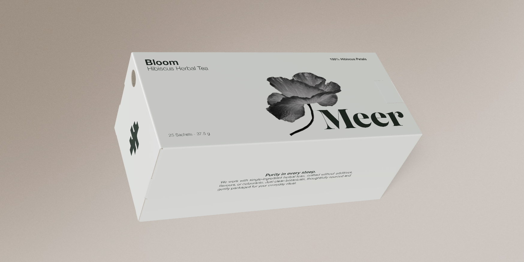
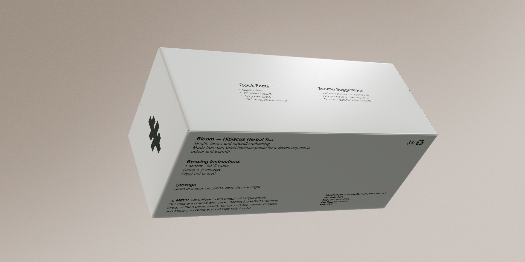
Brand and packaging system for a tea line, wordmark, minimal forms and considered surface typography to reflect purity and ritual.
Want to collaborate? I’m available for freelance and internship work.
Email me© 2025 Abhishek Jagtap — All rights reserved.